
Every project we carry forward is accompanied by a mark.
Essential. Technical. Distinctive.
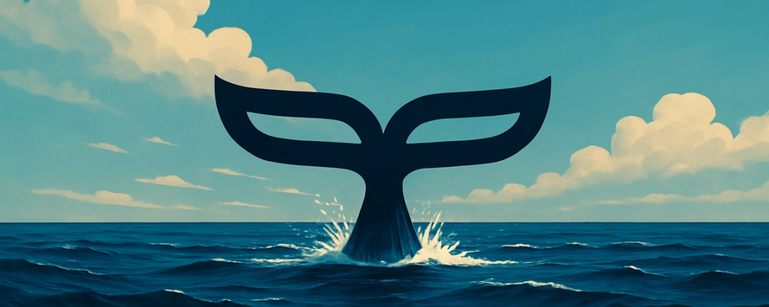
Our logo is inspired by one of the most iconic and functional elements of the marine world: the tail fin of a whale. A form that silently conveys what it stands for - propulsion, balance, and orientation.
The tail fin is the whale’s engine. It drives movement, ensures stability and direction, and allows the animal to navigate the ever-changing sea with harmony and strength. Just as the whale moves forward, PAD PROJECT leads each design process, turning creative energy into precise, coordinated, productive trajectories.
The stylized form we chose is more than a logo. It’s a symbol that reflects our way of working: pragmatic, clean, functional - and full of meaning.
There’s a deep bond between our identity and water: a vital, shifting, adaptive element. Our work flows in that same current - starting from a spark of intuition and following it methodically through to completion. Always with attention to detail, technical coherence, and a broad design vision.
Every day, we engage with a wide range of professionals: from shipyards to architects, from carpenters to owners, all the way to the final client. Navigating through a sea of information and expertise calls for a clear sense of direction. And we choose to follow it - visually too - through the symbol that holds our course.
The whale is a powerful yet graceful creature. Its fin evokes functional beauty, quiet majesty, and natural precision. These are the same values we see in our approach, which combines executive design and artisan sensibility.
Each time that mark appears - on a drawing, a document, a prototype - it speaks of what we aim to bring into the world: a technical, thoughtful, structured approach.
A symbol that moves with us. With the consistency, clarity, and direction of a push that leaves its mark.


